Why does the Liquid Death ad work?
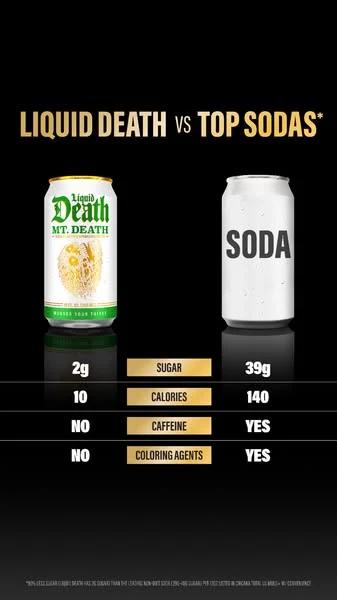
The table is the headline. There is almost no copy. The eye goes can, can, then down the rows. Sugar comes first because it is the biggest gap: 2g against 39g.
The enemy has no logo. A plain white can marked SODA stands in for every cola in the fridge. Nobody gets named, and the reader fills in their own brand.
The format fits the brand voice. Liquid Death is known for loud, jokey branding. Here the joke is restraint: black background, gold labels, and numbers that need no punchline.
What copy is worth stealing?
Here is every line of text on the ad and around it, transcribed as it ran. Spelling and capitals are the brand’s.
- On-ad headline
- LIQUID DEATH vs TOP SODAS*
- Table rows
- Sugar 2g / 39g · Calories 10 / 140 · Caffeine NO / YES · Coloring agents NO / YES
- Primary text
- 90% less sugar than top sodas (non-diet)*
- Link headline
- You won't believe it's not soda.
- Button
- Shop Now
What does the Liquid Death ad show?
The creative is a tall 9:16 image on a black background. At the top, gold condensed type reads LIQUID DEATH vs TOP SODAS, with an asterisk.
Below sit two cans. On the left is a white Liquid Death can marked MT. DEATH. On the right is a blank white can with one word on it: SODA.
Under the cans, a four-row table lines up the numbers. A strip of fine print runs along the bottom. It is too small to read in the feed, which is normal for a claim footnote.
Why do comparison charts work in ads?
A claim asks you to trust the brand. A chart asks you to check it. That small shift is why comparison charts show up so often in DTC ads, from drinks to mattresses.
The chart also does the hard part of persuasion for you. The reader sees 2g next to 39g and draws the conclusion. People believe conclusions they reach on their own more than ones they are handed.
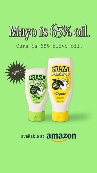
We file this under the comparison hook, next to ads like Graza’s “Mayo is 65% oil”, which runs the same play with one line of type instead of a table.
| Row | Liquid Death | Top sodas |
|---|---|---|
| Sugar | 2g | 39g |
| Calories | 10 | 140 |
| Caffeine | No | Yes |
| Coloring agents | No | Yes |
What details are easy to miss?
- Row order. The biggest gap comes first. If the table opened with caffeine, the ad would feel weaker.
- Binary rows. Two of the four rows are just NO and YES. They read faster than numbers and add variety.
- The asterisk. The headline and the primary text both carry one. It signals there is a definition (non-diet sodas) without cluttering the image.
- The link headline. “You won't believe it's not soda” is the only joke in the unit, and it sits outside the image.
When would this format fall flat?
A chart only works when the gap is big and easy to see. If your numbers are close, the table shows that too. A row like 120 calories against 140 invites a shrug.
It also needs a rival the reader already knows. “Top sodas” works because everyone has a picture of a cola. A chart against an obscure competitor makes people ask who that is.
How would you use this hook?
- Pick the one category your buyer is switching from, not a named competitor.
- List every measurable difference, then keep the three or four with the biggest gaps.
- Put the biggest gap on the first row and turn soft claims into yes/no rows.
- Strip the rest of the copy. Let the headline be “Us vs Them” and nothing more.
- Footnote the claim, and make sure the fine print holds up.
Where does the click go?
The display link on this ad reads AMAZON.COM, and the button says Shop Now. The ad does not send people to a brand page at all. It sends them to a retailer where they can buy in one tap.
That is a common choice for drinks sold in many stores. The trade-off is that the comparison stops at the ad. A shopper who lands on a product listing will not see the chart again unless the listing repeats it.
If you sell direct, the rule is simple: the first screen after the click should repeat the ad’s strongest row. More on that in our Facebook ad examples roundup.
Frequently asked questions
Is the Liquid Death comparison ad still running?
It was active in Meta’s Ad Library when we captured it on November 19, 2026. The library listed a start date of May 19, 2026. Search the Library ID 1288403139602929 to check its current status.
Can you name a competitor in a comparison ad?
You can in many markets, but it raises legal and review risk. Comparing against a category, as this ad does with “top sodas”, avoids most of it.
How many rows should a comparison chart have?
Three to five is a good rule of thumb for a feed ad. Fewer looks thin, and more cannot be read at a glance on a phone.